[ Android ] CustomView 필요성 및 구현 방법 (Kotlin)
1. CustomView의 필요성
- 기존의 View로는 구현할 수 없은 View
- 잠금해제 화면 : 터치를 받고 드레그를 인식해서 UI 에 나타내는 VIew
- 더 정밀한 제어가 필요한 경우
- 버튼과 일정 거리 이상 가까워지면 반응한단거나 하는 독특한 기능이 필요한 경우
- 특정 View lifecycle 에 따른 여러 뷰의 조작이 필요한 경우
- 여러 화면에서 사용하는 경우 재활용 가능
- 설정화면에서 설명과 토글 버튼 등등이 하나의 세트로 여러번 사용될 때 재활용할 수 있음
- custom view 적용시 수정 상황에 대해서 일괄적인 수정이 가능함
CustomView 는 생각보다 복잡하고 손이 많이 가지만 한번 익혀놓으면 재활용성이 뛰어나 많은 도움이 되는 것 같습니다.
( 그러나 위와 같은 필요성이 없는 경우엔 구현에 손이 많이 가기에 굳이 CustomView 를 사용하지 않는 것이 좋다. )
2. 구현 방법
아래 코드들은 데이터바인딩이 적용되어 있습니다.
2-1. CustomView 의 레이아웃을 만듭니다.
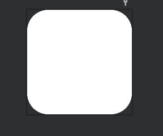
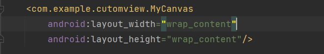
custom_round_buttom.xml ( res / layout 폴더)
<?xml version="1.0" encoding="utf-8"?>

<layout xmlns:android="http://schemas.android.com/apk/res/android"
    xmlns:app="http://schemas.android.com/apk/res-auto">

    <data>

    </data>

    <LinearLayout
        android:id="@+id/ll_custom_button_container"
        android:layout_width="90dp"
        android:layout_height="40dp"
        android:background="@drawable/custom_button_background"
        android:gravity="center"
        android:orientation="horizontal"
        android:padding="10dp">

        <ImageView
            android:id="@+id/iv_custom_button_icon"
            android:layout_width="32dp"
            android:layout_height="32dp"
            android:layout_gravity="center_vertical"
            app:tint="@color/black" />

        <TextView
            android:layout_marginLeft="5dp"
            android:id="@+id/tv_custom_button_text"
            android:layout_width="wrap_content"
            android:layout_height="wrap_content"
            android:gravity="center" />
    </LinearLayout>
</layout>
2-2. 속성을 추가합니다.
attrs.xml 에 필요한 속성을 추가하거나 파일이 없다면 추가해주세요
추후 button 의 속성을 부여할 때 쓰입니다.
속성에 값에 대한 분리를 통해 커스텀 뷰의 재사용성을 한층 더 증가 시킬 수 있습니다.
attrs.xml ( res / value폴더)
- CustomRoundButton 으로 명시된 이름을 통해 코드(.kt)에서 아래 속성들을 접근하게 됩니다.
- 아래 속성들을 정의함으로써 (.kt) 파일에서 기본값을 부여할 수 있게 됩니다.
<?xml version="1.0" encoding="utf-8"?>
<resources>
    <declare-styleable name="CustomRoundButton">
        <attr name="bgColor" format="reference|integer" />
        <attr name="imgSrc" format="reference|integer" />
        <attr name="imgColor" format="reference|integer" />
        <attr name="text" format="reference|string" />
        <attr name="textColor" format="reference|integer" />
    </declare-styleable>
</resources>
2-3. (옵션) CustomView 배경 만들기
특별한 배경을 한번에 적용하고 싶다면 drawble 을 만들어서 적용하는 것 이 편합니다.
custom_button_background.xml (res/drawable)
<?xml version="1.0" encoding="utf-8"?>
<shape xmlns:android="http://schemas.android.com/apk/res/android"
    android:padding="10dp"
    android:shape="rectangle">
    <solid android:color="#ffffff" />
    <corners
        android:bottomLeftRadius="100dp"
        android:bottomRightRadius="100dp"
        android:topLeftRadius="100dp"
        android:topRightRadius="100dp" />
</shape>
2-4. CustomView 코드 작성하기
- View 또는 상황에 적합 한 ViewGroup 을 상속받습니다.
- 이때 Context 와 AttributeSet 을 필수 생성자로 받습니다.
- AttributeSet 에 대한 생성자를 구현하지 않으면 LayoutXML 로부터 인스턴스를 만들 수 없다.
- 동적으로 코드로 CustomView 를 추가할때에는 Context 생성자만으로 가능한다.
CustomRoundButton.kt
class CustomRoundButton : LinearLayout {
    lateinit var binding: CustomRoundButtonBinding

    constructor(context: Context?) : super(context) {
        init(context)
    }

    constructor(context: Context?, attrs: AttributeSet?) : super(context, attrs) {
        init(context)
        getAttrs(attrs)

    }

    constructor(context: Context?, attrs: AttributeSet?, defStyleAttr: Int) : super(
        context,
        attrs,
        defStyleAttr
    ) {
        init(context)
        getAttrs(attrs, defStyleAttr)
    }

    private fun init(context: Context?) {
        binding = DataBindingUtil.inflate(
            LayoutInflater.from(context),
            R.layout.custom_round_button,
            this,
            false
        )
        addView(binding.root)
    }

    private fun getAttrs(attrs: AttributeSet?) {
        // attrs 를 참조함
        val typedArray = context.obtainStyledAttributes(attrs, R.styleable.CustomRoundButton)
        setTypeArray(typedArray)
    }

    private fun getAttrs(attrs: AttributeSet?, defStyle: Int) {
        val typedArray =
            context.obtainStyledAttributes(attrs, R.styleable.CustomRoundButton, defStyle, 0)
        setTypeArray(typedArray)
    }

    //디폴트 설정
    private fun setTypeArray(typedArray: TypedArray) {

        val backgroundLayout = typedArray.getResourceId(R.styleable.CustomRoundButton_bgDrawable, R.drawable.custom_button_background)
        binding.llCustomButtonContainer.setBackgroundResource(backgroundLayout)

        val imgResId = typedArray.getResourceId(R.styleable.CustomRoundButton_imgColor,R.drawable.ic_baseline_menu_24)
        binding.ivCustomButtonIcon.setBackgroundResource(imgResId)

        val textColor = typedArray.getColor(R.styleable.CustomRoundButton_textColor,0)
        binding.tvCustomButtonText.setTextColor(textColor)

        val text = typedArray.getText(R.styleable.CustomRoundButton_text)
        binding.tvCustomButtonText.text = text

        typedArray.recycle()
    }
}
3. Custom View 디버깅 및 주의사항
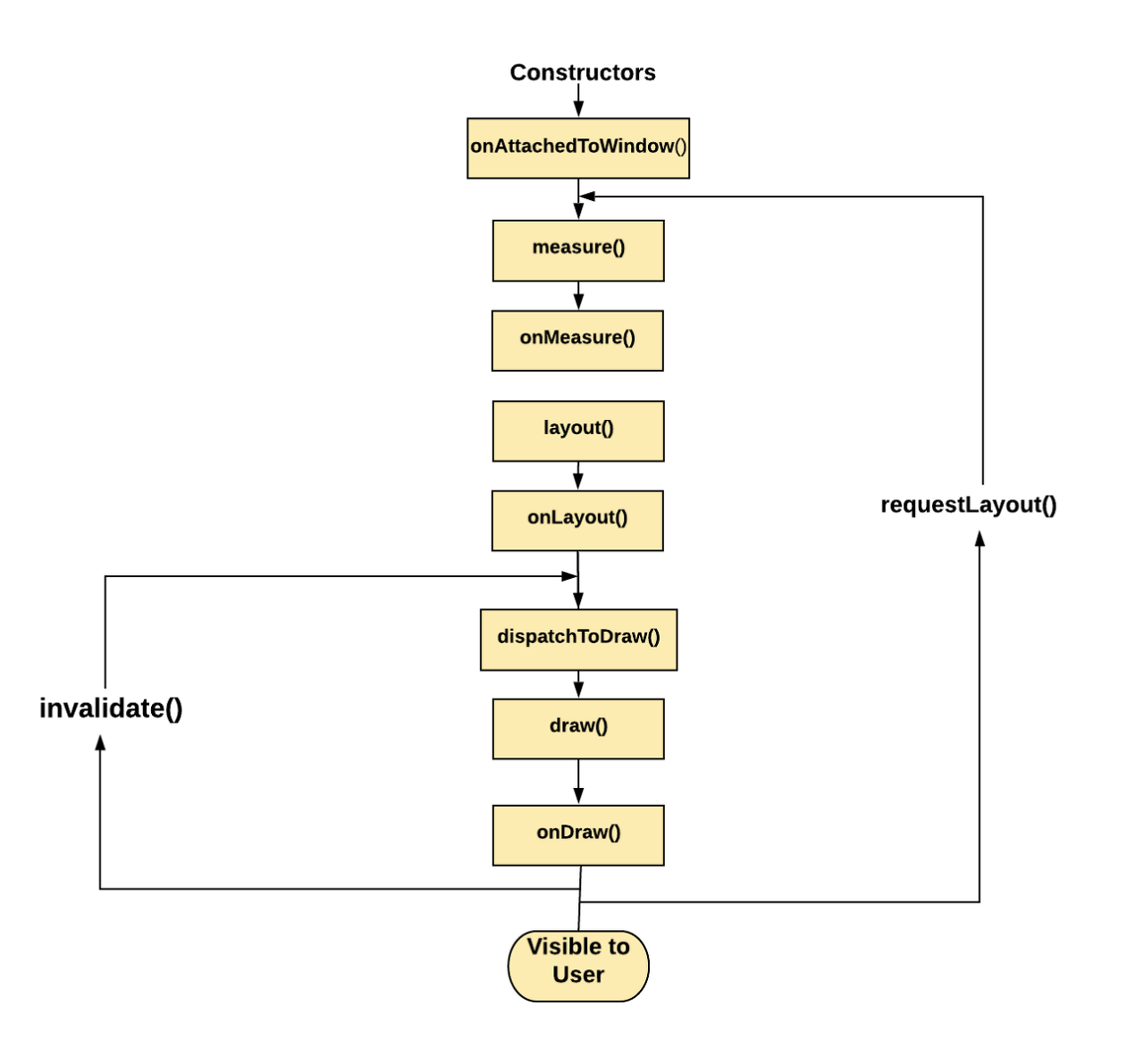
custom view 를 사용하기 위해서는 아래 View 생명주기를 잘 이해하고 활용할 필요가 있습니다.
아래와 같은 순서로 View 는 사용자에게 보여지게 됩니다..
본인도 처음 customView를 사용할 때 view 의 생명주기에 대한 이해 부족으로 아래와 같은 실수를 한적이있습니다.
https://easycodediary.tistory.com/103?category=891906
[ Android ] customView의 onDraw 함수 디버깅 기록
1. 문제 상황 CumtomView 특정 점이 터치가 되면 리스너로 View(MVP 모델의 ) 전달하고 해당 위치 데이터를 이용해 Presenter 를 거쳐 Model을 업데이트 한 뒤 다시 model 의 바뀐 내용대로 포문을 돌면서 커
easycodediary.tistory.com
onDraw 부분을 오버라이딩해서 canvas를 이용해 다양한 이미지를 연출 할 수 있습니다.
이때 중요한 것은 onDraw 내에서 객체를 생성하는등 그리기에 필요한 이외의 활동은 자제하는 것이 좋습니다.
이유는 아래 공식문서에 명시되어 있습니다.
또 onTouchEvent 등 과 같이 View 에서 제공하는 여러 이벤트 관련 함수들을 오버라이딩하여 다양한 기능을 구현할 수 있습니다.
https://developer.android.com/training/custom-views/custom-drawing?hl=ko
맞춤 그리기 | Android 개발자 | Android Developers
맞춤 뷰에서 가장 중요한 부분은 디자인입니다. 맞춤 그리기는 애플리케이션의 필요에 따라 쉽거나 복잡할 수 있습니다. 이 과정에서는 가장 일반적인 작업 몇 가지에 관해 설명합니다. 맞춤 뷰
developer.android.com